
You can override the default figure size by including the figsize keyword argument:
fig = plt.figure(figsize=(8,6)) # create a figure that is 8" x 6"
To make all figures in a notebook use a different size, you can execute the following code near the top of the notebook:
import matplotlib as mpl
mpl.rcParams['figure.figsize'] = (8.0, 6.0)
Or you can put your preference in your matplotlibrc so that it is loaded automatically every time you use matplotlib. See Configuration for details.
A figure can have more than one set of Axes. There are several ways to create
these. The simplest is plt.subplots(), which creates a new figure and populates
it with the number of rows and columns of subplots that you specify.
fig, axes = plt.subplots(1, 2, figsize=(8,5))
axleft, axright = axes  # if there is only one row, axes is a vector; otherwise, a 2-D array
axleft.plot(np.random.random(20), np.random.random(20), 'ro')
axright.plot(np.random.random(15), np.random.random(15), 'bs', markersize=12)
If you wish to tie certain axes of the subplots to one another, pass
sharex=True and/or sharey=True as optional keyword arguments to
plt.subplots(). In Fig. 1 the value of sharey was implicitly set to
False.
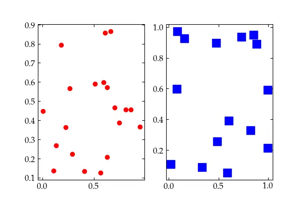
Fig. 1 — A simple figure with two subplots
Had we passed sharey=True to the plt.subplots() command, we would have
obtained a figure like Fig. 2.
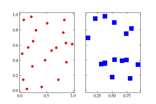
Fig. 2 — Two subplots with a shared y axis
For more control you can pass in a gridspec_kw dictionary to generate a
GridSpec object to determine just how the figure’s space will be allocated to
the subplots. See
the GridSpec page for more information.
Axes should be labeled (with units, where appropriate). The following example
assumes that usetex=True. See Configuration for how to set that up.
fig3, ax3 = plt.subplots(figsize=(6,4))
t_vals = np.arange(0.0, 1.0, 0.01)
sines = np.sin(2 * np.pi * t_vals)
cosines = np.cos(2 * np.pi * t_vals)
ax3.plot(t_vals, sines, 'b.', t_vals, cosines, 'ro')
ax3.set_xlabel(r'$t$')
ax3.legend([r'$\sin(2\pi t)$', r'$\cos(2\pi t)$']);
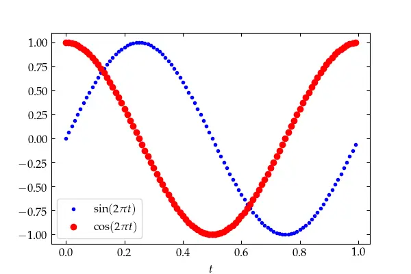
Using LaTeX to produce properly formatted labels, with variables set in italics and functions in roman font.
In this example, the legend was created by passing in a list of strings, one for each trace. A better approach is to build in the labels for the legend explicitly:
    fig4 = plt.figure(4, figsize=(6,4))
    ax4 = fig4.add_subplot(111)
    ax4.plot(t_vals, sines, 'b.', label=r'$\sin(2\pi t)$')
    ax4.plot(t_vals, cosines, 'ro', label=r'$\cos(2\pi t)$')
    ax4.set_xlabel(r'$t$')
    ax4.legend() # put the legend in the 'best' location automatically
To plot a series of data with error bars, use errorbar(xdata, ydata,
yerr=yerrors). Here’s an example that loads some data from a web site using
the pandas package. Pandas makes it easier to work with tables of data.
import pandas as pd
the_data = pd.read_table('https://www.physics.hmc.edu/courses/p134/CircularMoore2004.txt')
ebars = plt.figure()
eax = ebars.add_subplot(111)
eax.errorbar(the_data['x'], the_data['I'], color="#800000",
  yerr=the_data['I_err'] * 50, fmt='D', marker='D', markersize=4, capsize=4)
eax.set_xlabel('Position (mm)')
eax.set_ylabel('Intensity (V)');
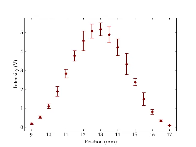
A figure with error bars showing data taken by a student in Physics 134, Optics Lab (I had to grow the error bars by a factor of 50 so you could see them!).
The pd.read_table() call produces a pandas DataFrame. You can examine the
contents of the frame just by entering the variable name in a cell:
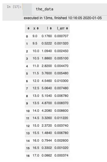
Figure 3 — A pandas DataFrame.
See Pandas for more information on how to use pandas.