
To plot a function in matplotlib you need to first compute \(x\) values and \(y\) values. Let’s see how to plot the function \begin{equation} y(x) = \frac{1}{\sqrt{(1-x^2)^2 + 4 \zeta^2 x^2}} \end{equation} where \(\zeta\) is called the damping parameter and x represents the ratio of the frequency of an oscillator to its natural frequency, as you learned in E79.
Can you imagine what the curve looks like for \(x \ge 0\)? See if you can guess the shape of the curve for a value of \(\zeta \ll 1\) and also for \(\zeta > 1\). Then proceed.
We need to pick a suitable range of the independent variable x. I’m going to
start at zero and go to \(x = 4\) for starters. Let’s use 201 points over that
interval. Fortunately, numpy has a very convenient function we can use:
x = np.linspace(0, 4, 201) # make an array of 201 equally spaced
                           # values between 0 and 4, inclusive
x                          # show the values we just computed
Can you explain why we used 201 points, not 200?
Now we need to calculate the corresponding values of \(y\). But those values
depend on the value of \(\zeta\), which we haven’t yet specified. Let’s write a
little function to take two inputs, the x array of values and a single value of
\(\zeta\), producing the corresponding values of y.
def myfunc(x: np.ndarray, zeta:float):
    """Calculate the y values given by the equation defined above in the section
    called Plotting a function
    """
    return 1.0 / np.sqrt((1 - x*x)**2 + 4 * zeta**2 * x*x)
Some explanations:
myfunc takes two arguments, and their types are indicated after the
colons. Where possible, specifying the type expected for the argument makes
your functions easier to interpret.np.ndarray is the kind of array that gets returned from
np.linspace; it is a very commonly used type in numpy.math module. The numpy version notices when an argument is not a single
number but a np.ndarray of values and automatically calculates for each value
in the array.Read that last bullet point again. NumPy calls this feature broadcasting; it is really nice. It means we don’t need to write loops to compute array values; numpy will take care of that for us.
Let’s try a curve with a small value of damping parameter \(\zeta\).
    y = myfunc(x, 0.1)
    fig, ax = plt.subplots()
    ax.plot(x, y, label="0.1")
    ax.set_xlabel("$x$")
    ax.set_ylabel("$y$");
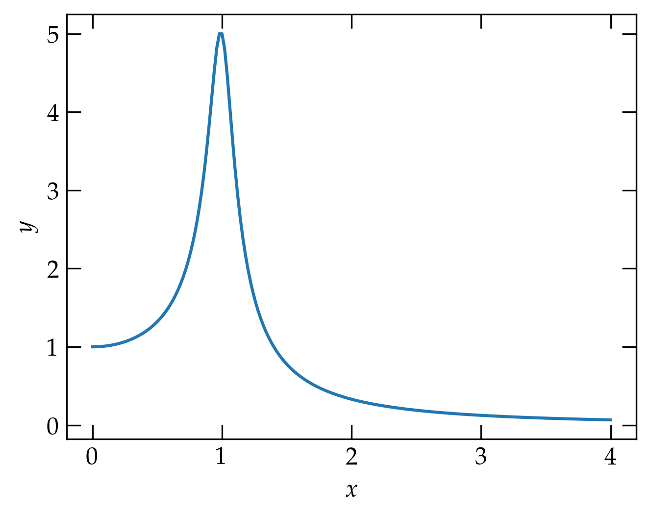
Okay, that looks like a peak near \(x = 1\) (which means that the frequency is near the natural frequency). Now let’s add a curve on the same axes but with \(\zeta = 0.5\) this time.
y2 = myfunc(x, 0.5)
ax.plot(x, y2, label="0.5")
ax.legend();
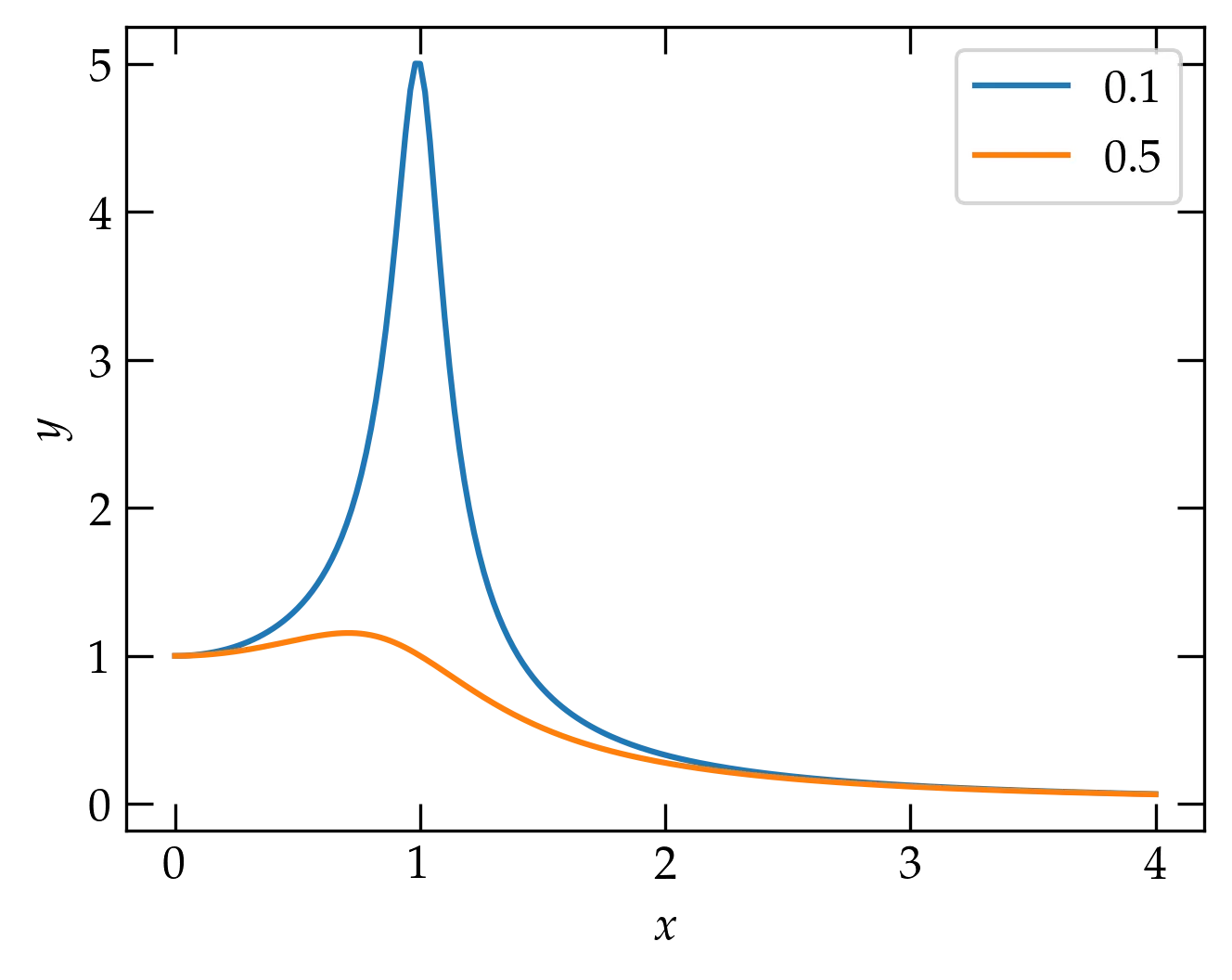
Stronger damping attenuates the resonance peak.
Well, that’s interesting. Increasing the damping parameter really pushed the peak down. I wonder if we could make a plot that showed curves for several values of damping parameter. Let’s try.
fig, ax = plt.subplots()
ax.set_xlabel("$x$")
ax.set_ylabel("$y$")
for zeta in (0.05,0.1, 0.2, 0.5, 1, 2):
    y = myfunc(x, zeta)
    ax.plot(x, y, label=r"$\zeta = %g$" % zeta)
ax.legend();
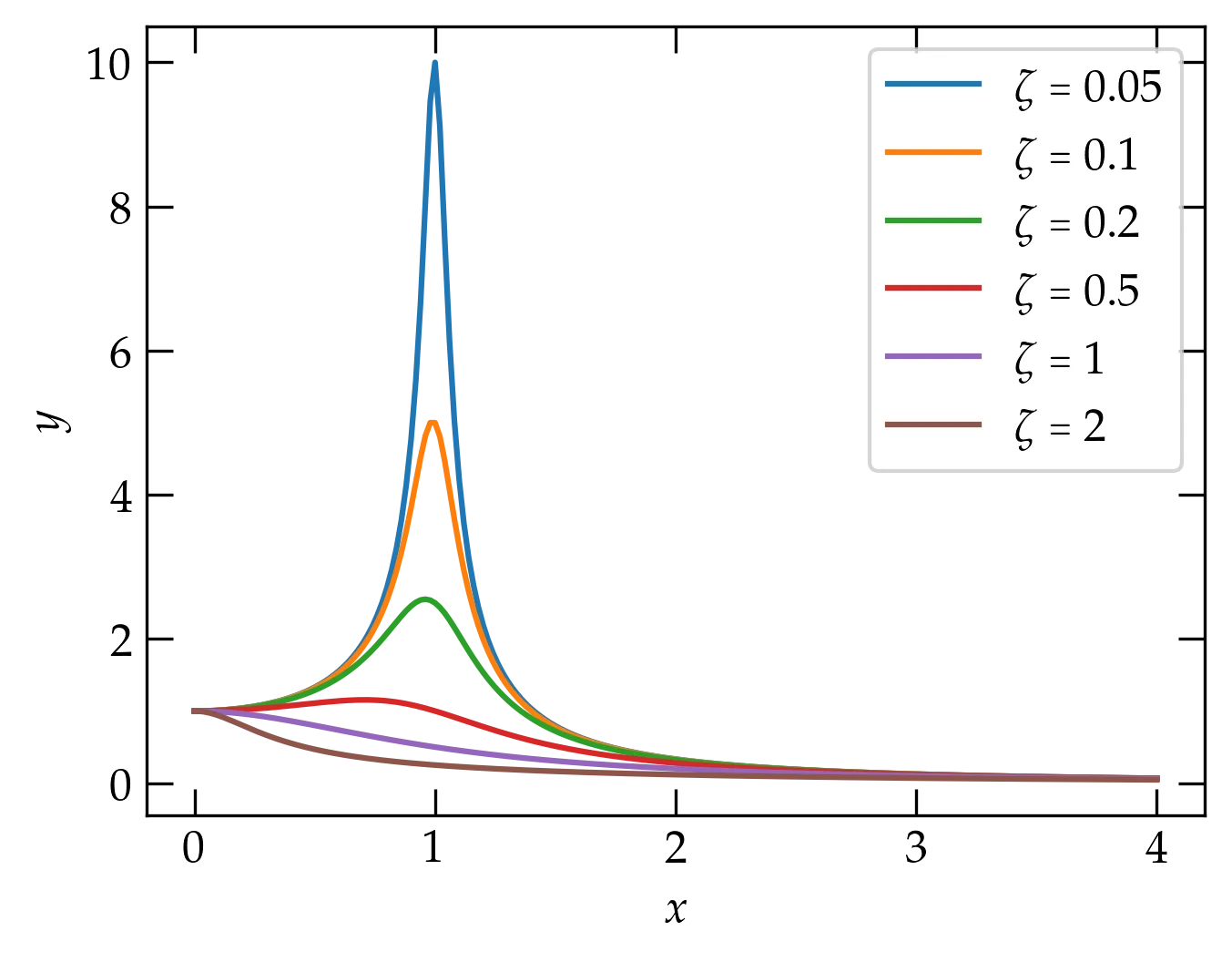
Now our resonance cup runneth over!
Can you summarize the behavior you observe?
You may notice that when the damping parameter is small, we aren’t calculating enough points near the peak to get a smooth curve. One strategy would be to use more points in x, but that seems inelegant: we don’t need all those extra points except around the peak.
We can use np.concatenate to generate a set of points for x that are more closely spaced around the peak:
x = np.concatenate((
    np.arange(0.0, 0.75, 0.02),
    np.arange(0.75,1.25, 0.005),
    np.arange(1.25, 2, 0.05)
    ))
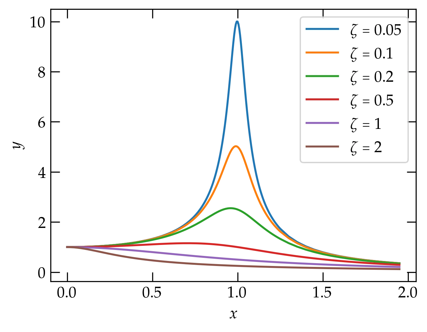
Smoother curves around the peak.
It turns out that this plot will look better if we use logarithmic axes. Let’s see what that looks like. For grins, I’m going to compute a more suitable set of \(x\) values first.
logx = np.logspace(-1, 1, 201)
fig, ax = plt.subplots()
ax.set_xlabel("$x$")
ax.set_ylabel("$y$")
for zeta in (0.05, 0.1, 0.2, 0.5, 1, 2):
    y = myfunc(logx, zeta)
    ax.loglog(logx, y, label=r"$\zeta = %g$" % zeta)
ax.legend();
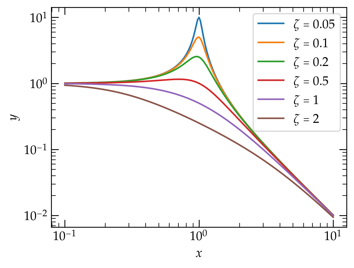
Now our resonance cup runneth over in style!
How would you summarize the behavior you observe in this plot?
Let’s see if you can now apply what we’ve explored so far.
hermione that has 51 equally spaced points between 0 and 1, inclusive.hermione. Use blue dots to plot
the points by passing ‘bo’ to the plot function.You can modify the way a trace appears with both positional and keyword arguments to the call to =plot(xvals, yvals)=. For a few basic colors, you can use the following shortcuts:
| color code | meaning | symbol code | meaning |
|---|---|---|---|
'b' |
blue | 'o' |
filled circle |
'r' |
red | '.' |
dot |
'g' |
green | '*' |
star |
'k' |
black | '-' |
line |
'y' |
yellow | 'v' |
triangle down |
'w' |
white | '^' |
triangle up |
'm' |
magenta | 's' |
square |
'c' |
cyan | 'd' |
thin diamond |
You can also use an RGB or RGBA notation, such as =#0f0800= or =#0f0f0f80=. To combine such a color specification with a marker designation, use a command such as the following
ax.plot([0, 0.25, 0.5, 0.75], [1, 0.75, 0.5, -0.25], 'o', color='#44bb60')
See markers for more marker options and colors for more options for representing colors.