
Pandas is a Python module that provides features somewhat akin to a spreadsheet or database and meshes very naturally with both NumPy and Matplotlib. Before we can explore it, we need to import this module.
If you enter import pandas as pd in a cell in a Jupyter notebook and Python
doesn’t complain, pandas is already installed. If not, installing is easy. If you
are running jupyter notebook having installed with pip, enter
pip install pandas
If you are using Anaconda, use
conda install pandas
The easiest way to create a DataFrame is from a dictionary of arrays, which
all must have the same length. Here’s a simple example.
fibo = [1, 1, 2, 3, 5, 8, 13, 21]
prime = [2, 3, 5, 7, 11, 13, 17, 19]
nifty = [0., np.euler_gamma, np.sqrt(np.pi)/2, 1., np.sqrt(np.pi), 2.0, np.e, np.pi]
df = pd.DataFrame(dict(Fibonacci=fibo, Prime=prime, Nifty=nifty))
If we ask Jupyter to display the DataFrame by submitting df, this is what we get:
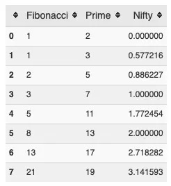
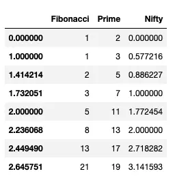
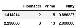
In combination with Jupyter, pandas generates a nice looking table, with column heads you can use for sorting. In this case, everything is sorted in ascending order, so the sort buttons aren’t particularly useful. In general, however, they can be quite useful. Also in this case, I have not set an index array, so Pandas uses the default integer vector starting from zero. Let’s change the index of this DataFrame to use the square root of integers:
df.index = np.sqrt(range(8))
df
which generates the output
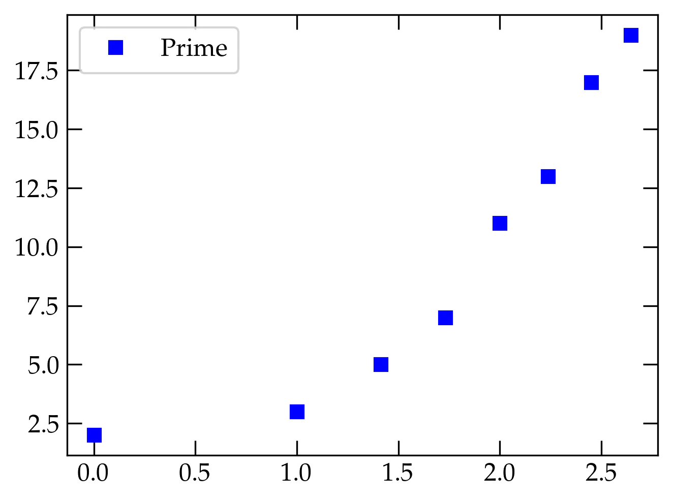
Plotting a pandas data column against the index is straightforward. Since I
would like a plot of discrete points, I will add the keyword argument style
and use it to specify blue squares:
df.plot(y='Prime', style='bs')
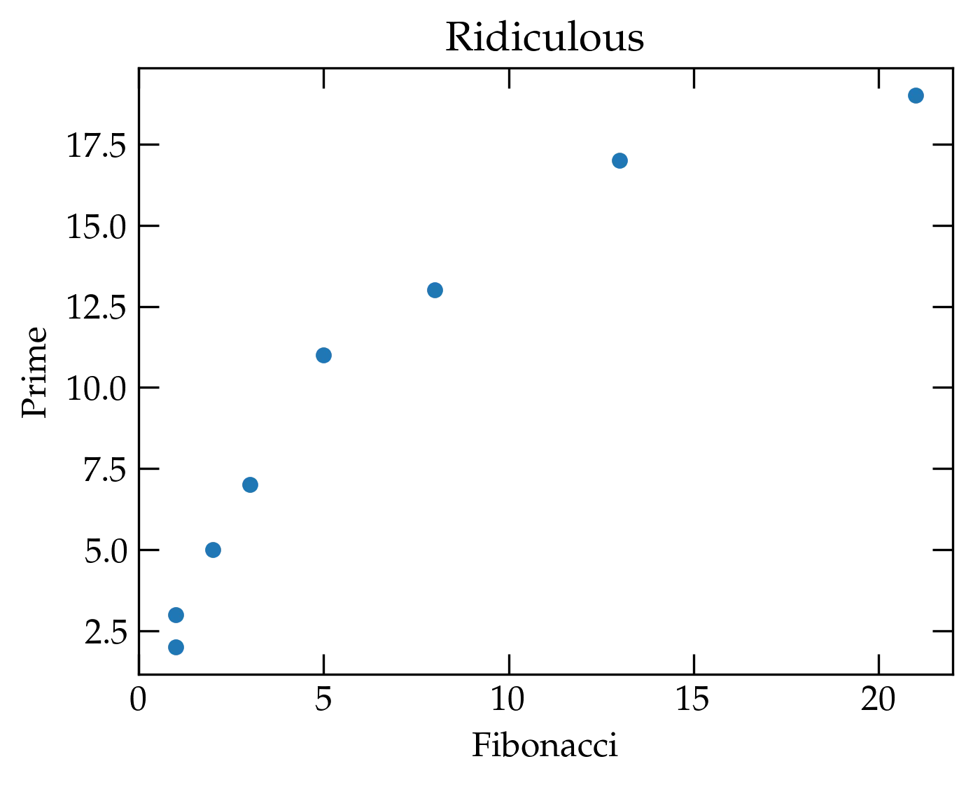
If I would rather plot one column against another, I can specify both x and
y values. I’ll gussy up some other things, too.
df.plot(x='Fibonacci', y='Prime', kind='scatter', title='Ridiculous')
As usual, you can get lots more information about a command by asking for help:
help(df.plot)
Suppose we wanted to work only with the data in the table for which the Fibonacci number was even. We can construct a new subset table with the following command
df[df['Fibonacci'] % 2 == 0]
which yields
What’s going on here? The interior expression, df['Fibonacci'] % 2 == 0
produces a boolean array of values, one for each row in the DataFrame. This
array is then used to index into df, yielding only those rows corresponding to
True values in the array.
You can access individual columns either with a string index, as in the previous example, or as a data member field of the same name:
df.Fibonacci

0.000000     1
1.000000     1
1.414214     2
1.732051     3
2.000000     5
2.236068     8
2.449490    13
2.645751    21
Name: Fibonacci, dtype: int64
On the Matplotlib introduction page, we developed the following figure.
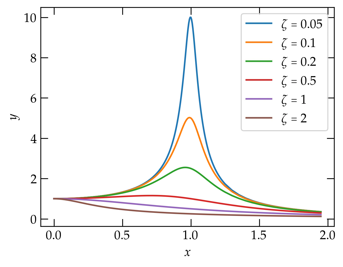
Now our resonance cup runneth over in style!
I’m going to recompute the values plotted in this figure and store them in a pandas DataFrame for easy display.
# First make a dictionary of vectors
values = {z:myfunc(logx, z) for z in (0.05, 0.1, 0.2, 0.5, 1, 2)}
# Now create a pandas DataFrame to store them
df = pd.DataFrame(values, index=logx)
df
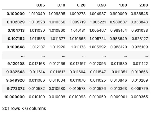
Displaying a pandas DataFrame.
You can access individual columns using their name:
   df[0.2]
   df.plot(logx=True, logy=True, xlabel="$x$", ylabel="$y$");
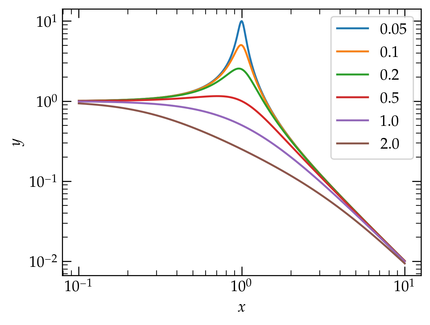
With the curves in a pandas DataFrame, the plot command takes a single line.
Notice how the value of \(\zeta\) doesn’t affect the frequencies either significantly below the natural frequency (\(x = 1\)) nor significantly above it, where all the curves fall off in the same way with increasing frequency. Also note how the plotting operation could be achieved with a single call, with the various properties adjusted with keyword arguments.
I have placed some experimental data with uncertainties at https://www.physics.hmc.edu/courses/p134/CircularMoore2004.txt. The \(x\) axis variable is the position of the detector (in mm); the \(y\) axis variable is the observed light intensity (in volts); the \(y\) uncertainty values are in the same units.
Prepare a plot of these data using discrete points for the data, error bars set according to the uncertainties, and see if you can style your graph exactly like the one shown below. Feel free to consult the matplotlib documentation as liberally as you like!
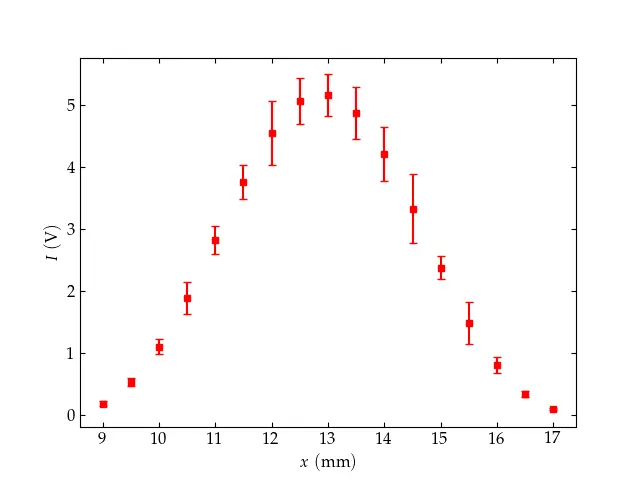
Target practice: Can you make your plot look exactly like this one?
Hints
import pandas as pd
the_data = pd.read_table('filename_or_URL')
You can then see a table of the data by entering the_data in a Jupyter
cell. You can access individual columns of the data by name: the_data['x'] or
the_data.x.
The command to plot with error bars is ax.errorbar(xvals, yvals, yerrors)
and you can add lots of keyword arguments to make things look the way you
wish. To make a pleasant-looking plot, I recommend scaling the errors in
Moore’s data by a factor of 50 (yeah, he was good!). The data in the
\(x\) column is the position of the detector in millimeters, while the data in
the columns labeled I and I_err are the intensity and intensity errors,
with values in volts.
Potentially interesting keywords:
markerfmtmarkersizecapsize